
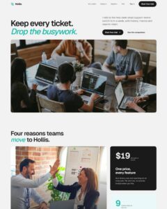
 Compare Features LandingLanding page, 1 page
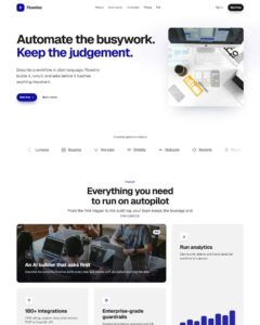 Flowline SaaS LandingLanding page, 1 page
 Prismo Creative AgencyCreative, 1 page
 Velour Car DetailingLanding page, 1 page
Pixel Reveal Product Card
Product card built as a plain, fully editable Bricks tree: section > container > grid of "Product Card" component instances (add/remove/reorder in Layers). Card props: primaryImage, primaryImageAlt, secondaryImage, seconda…
50 sites for €79 only, Compare all plans
All photos and visual assets used in this preview are sourced from Unsplash.
The system behind it
One pattern, your whole brand.
Pixel Reveal Product Card reads your ACSS tokens, so changing a color, a font or a spacing value once restyles it everywhere. No hard-coded values, nothing to override.
- Type
- Component
- Category
- Cards
- Responsive
- Desktop to phone
- Works with
- Bricks, ACSS, plain CSS
Options 3
Set on the section, in Bricks’ attributes panel. No code needed.
data-tilesmosaic density: fewer, larger tiles vs
data-patternthe order tiles reveal in: left-to-right sweep, randomised scatter, or out from the centre
data-speedtotal reveal duration
Component props 1
Only the repeating unit is a component. Duplicate, reorder or delete it in Layers and edit these props.
primaryImagehttps://images.unsplash.com/photo-1553062407-98eeb64c6a62?w=800
primaryImageAltRidge Canvas Tote shown from the front
secondaryImagehttps://images.unsplash.com/photo-1591561954557-26941169b49e?w=800
secondaryImageAltRidge Canvas Tote shown in a styled setting
titleRidge Canvas Tote
descriptionWaxed canvas, leather straps, room for a laptop and a week away.
price$128
buyLabelBuy now
buyUrl#shop
openInNewTabFalse
Included in Pro €99 once with Pro Unlimited Lifetime: all 785 patterns, unlimited sites.
Get Pro