
 Compare Features LandingLanding page, 1 page
 Flowline SaaS LandingLanding page, 1 page
 Prismo Creative AgencyCreative, 1 page
 Velour Car DetailingLanding page, 1 page
Snapshot Deck
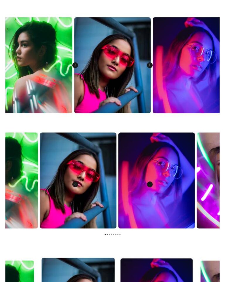
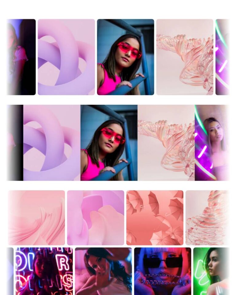
Compact, fully editable Bricks tree: section > container > header (eyebrow, h2, intro) > deck (a physical-feeling stack of six "Deck Photo" component instances) > controls (prev/next, counter). Only the photo is a componen…
50 sites for €79 only, Compare all plans
All photos and visual assets used in this preview are sourced from Unsplash.
The system behind it
One pattern, your whole brand.
Snapshot Deck reads your ACSS tokens, so changing a color, a font or a spacing value once restyles it everywhere. No hard-coded values, nothing to override.
- Type
- Component
- Category
- Cards
- Responsive
- Desktop to phone
- Works with
- Bricks, ACSS, plain CSS
Options 11
Set on the section, in Bricks’ attributes panel. No code needed.
data-themere-themes the card
data-sizemax width of the deck, default m
data-fanhow far the cards behind peek out and tilt, default subtle
data-radiuscorner radius from the ACSS radius tokens
data-hoverfront-card hover/focus effect
data-dragdrag or swipe the front card away to advance
data-autoplaydata-delayms
data-loopkeeps auto-advancing past the last card
data-arrowsdata-counterComponent props 1
Only the repeating unit is a component. Duplicate, reorder or delete it in Layers and edit these props.
photohttps://images.unsplash.com/photo-1554080353-a576cf803bda?w=640
photoAltStill life, warm studio light
captionStudio set, morning light
tagEditorial
Included in Pro €99 once with Pro Unlimited Lifetime: all 785 patterns, unlimited sites.
Get Pro