
 Compare Features LandingLanding page, 1 page
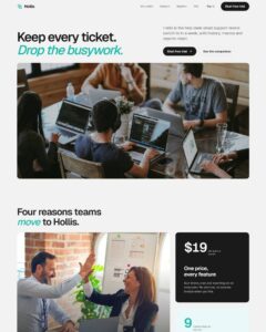
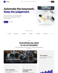 Flowline SaaS LandingLanding page, 1 page
 Prismo Creative AgencyCreative, 1 page
 Velour Car DetailingLanding page, 1 page
Perspective Card Deck
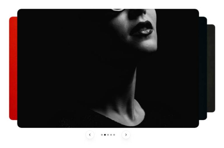
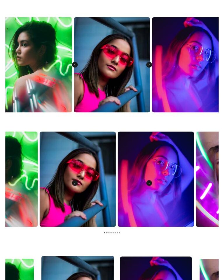
Plain editable Bricks tree: section > container > header (eyebrow, h2, intro) > perspective stage holding six "Deck Card" component instances > controls (dots/counter, prev/next, pause). Only the card is a component, with…
50 sites for €79 only, Compare all plans
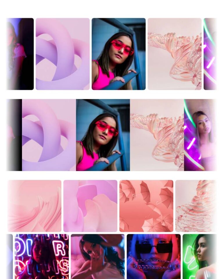
All photos and visual assets used in this preview are sourced from Unsplash.
The system behind it
One pattern, your whole brand.
Perspective Card Deck reads your ACSS tokens, so changing a color, a font or a spacing value once restyles it everywhere. No hard-coded values, nothing to override.
- Type
- Component
- Category
- Galleries
- Responsive
- Desktop to phone
- Works with
- Bricks, ACSS, plain CSS
Options 8
Set on the section, in Bricks’ attributes panel. No code needed.
data-themere-themes the whole section
data-spreadhorizontal distance and rotation between receding cards
data-autoplaydata-delayms
data-loopwrap past the first/last card
data-dragpointer drag / touch swipe to step
data-arrowsdata-paginationComponent props 1
Only the repeating unit is a component. Duplicate, reorder or delete it in Layers and edit these props.
imagehttps://images.unsplash.com/photo-1517841905240-472988babdf9?w=900
imageAltLow light, held steady
eyebrowField notes
titleLow light, held steady
captionA quiet series shot handheld at dusk, printed on uncoated stock.
linkUrl#work
linkLabelView series
Included in Pro €99 once with Pro Unlimited Lifetime: all 785 patterns, unlimited sites.
Get Pro