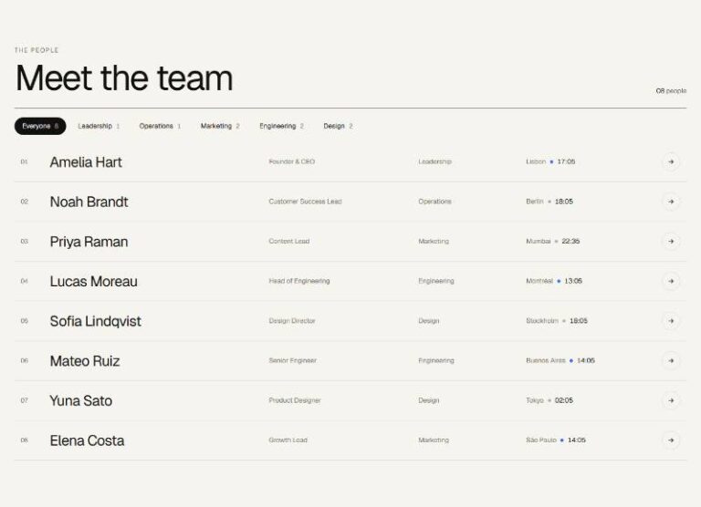

 Compare Features LandingLanding page, 1 page
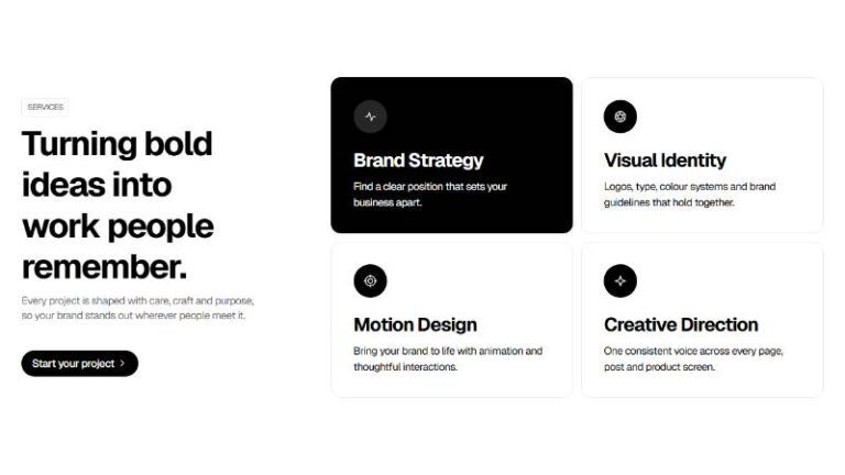
 Flowline SaaS LandingLanding page, 1 page
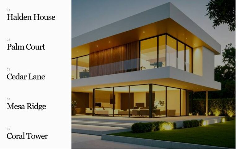
 Prismo Creative AgencyCreative, 1 page
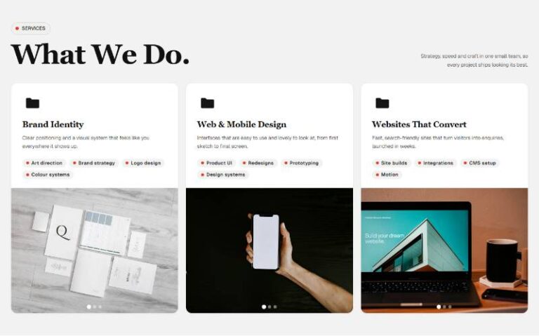
 Velour Car DetailingLanding page, 1 page
Aurora Topic Grid
Dark editorial topic grid built as a plain, fully editable Bricks tree: section > container > header (eyebrow, h2, intro, "view all" link) > a 2×2 grid of four "Aurora Topic Card" component instances (abstract cover art, t…
50 sites for €79 only, Compare all plans
All photos and visual assets used in this preview are sourced from Unsplash.
The system behind it
One pattern, your whole brand.
Aurora Topic Grid reads your ACSS tokens, so changing a color, a font or a spacing value once restyles it everywhere. No hard-coded values, nothing to override.
- Type
- Layout
- Category
- Grids and cards
- Responsive
- Desktop to phone
- Works with
- Bricks, ACSS, plain CSS
Options 5
Set on the section, in Bricks’ attributes panel. No code needed.
data-themere-themes the whole section
data-columnsgrid columns at desktop width (always 1 below the tablet breakpoint, 2 at tablet)
data-hoverhover/focus effect: coloured aura bleeding out behind the card, plain lift, a soft edge glow only, or nothing
data-radiuscorner radius from the ACSS radius tokens
data-spotlightpointer-tracked light sweeping across the card image (fine pointers only)
Component props 1
Only the repeating unit is a component. Duplicate, reorder or delete it in Layers and edit these props.
imagehttps://images.unsplash.com/photo-1557682250-33bd709cbe85?w=720
imageAltDesigning with restraint
tagPrimaryCraft
tagSecondaryProcess
bylineField notes
titleDesigning with restraint
href#topic
toneviolet
Included in Pro €99 once with Pro Unlimited Lifetime: all 785 patterns, unlimited sites.
Get Pro