
 Compare Features LandingLanding page, 1 page
 Flowline SaaS LandingLanding page, 1 page
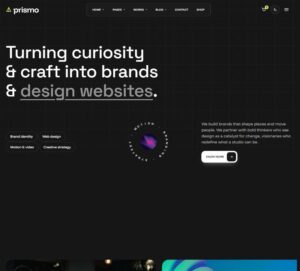 Prismo Creative AgencyCreative, 1 page
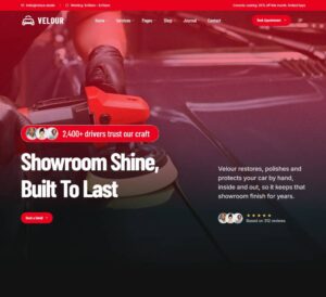 Velour Car DetailingLanding page, 1 page
Bricks Mega Menu
Platform header with a morphing mega menu, as a plain, fully editable Bricks tree: header > container > bar (brand, nav with Products, Solutions and Resources panels plus Customers and Pricing links, Sign in, CTA, menu tog…
50 sites for €79 only, Compare all plans
All photos and visual assets used in this preview are sourced from Unsplash.
The system behind it
One pattern, your whole brand.
Bricks Mega Menu reads your ACSS tokens, so changing a color, a font or a spacing value once restyles it everywhere. No hard-coded values, nothing to override.
- Type
- Layout
- Category
- Footers and headers
- Responsive
- Desktop to phone
- Works with
- Bricks, ACSS, plain CSS
Options 25
Set on the section, in Bricks’ attributes panel. No code needed.
data-themedata-accentaccent token for icon tiles, badges, links and the CTA
data-positiondefault static so it never overlaps other sections
data-headroomwith sticky or fixed: hides on scroll down, returns on scroll up, adds a soft shadow once scrolled
data-aligndesktop nav placement
data-dividerhairline under the bar
data-hovertop item hover and open style
data-triggerhow panels open on desktop (click and keyboard always work)
data-close-delayms · hover intent
data-morphone shared surface that morphs between panels, or a separate card per panel
data-caretgliding caret under the open trigger
data-distancepx · how far panel content slides when switching
data-iconsicon treatment in links
data-radiusand
data-shadowfor the dropdown surface
data-animdata-durationms
data-easingor any cubic-bezier
data-overlaydims the page for the mobile drawer only, for every open menu, or never
data-drawer-sidedata-accordiondata-swipeswipe the drawer closed
data-scroll-lockdata-cta-mobileshow Sign in, the CTA, and the compact CTA in the phone bar
data-demodemo hero below the bar for previews
Component props 4
Only the repeating unit is a component. Duplicate, reorder or delete it in Layers and edit these props.
labelNew
toneaccent
labelVisual builder
url#
showDescriptionTrue
descriptionDesign pages on a live canvas
showIconTrue
iconlayout
showBadgeTrue
stylecard
showImageTrue
imagehttps://images.unsplash.com/photo-1541462608143-67571c6738dd?w=720
imageAltDesk flat lay with wireframes, a keyboard and a coffee
showEyebrowTrue
eyebrowWhat is new
titleVersion 4.2: shared design tokens
showTextTrue
textOne palette for every site. Change a token and forty pages follow.
linkLabelRead the release
url#
imagehttps://images.unsplash.com/photo-1531403009284-440f080d1e12?w=240
imageAltPaper wireframes pinned to a whiteboard
categoryGuide
titleDesign tokens without the spreadsheet
showMetaTrue
meta6 min read
url#
Included in Pro €99 once with Pro Unlimited Lifetime: all 785 patterns, unlimited sites.
Get Pro