
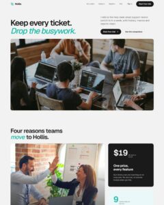
 Compare Features LandingLanding page, 1 page
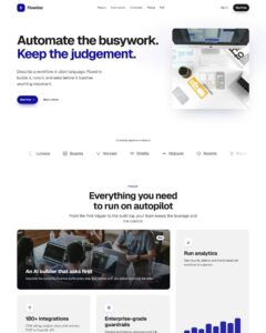 Flowline SaaS LandingLanding page, 1 page
 Prismo Creative AgencyCreative, 1 page
 Velour Car DetailingLanding page, 1 page
Gradient Progress Bars
Progress bars that fill and count up when they scroll into view: gradient, striped (sliding stripes), segmented and glow styles, each with a label and a live percentage, plus a conic-gradient progress ring. Bar componen…
50 sites for €79 only, Compare all plans
All photos and visual assets used in this preview are sourced from Unsplash.
The system behind it
One pattern, your whole brand.
Gradient Progress Bars reads your ACSS tokens, so changing a color, a font or a spacing value once restyles it everywhere. No hard-coded values, nothing to override.
- Type
- Element
- Category
- Progress bars
- Responsive
- Desktop to phone
- Works with
- Bricks, ACSS, plain CSS
Options 4
Set on the section, in Bricks’ attributes panel. No code needed.
data-themesurface of the showcase section
data-sizebar thickness
data-animatefill and count up when the bars scroll into view
data-animentrance
Component props 1
Only the repeating unit is a component. Duplicate, reorder or delete it in Layers and edit these props.
labelDesign
value80
stylegradient
toneprimary
showValueTrue
Included in Pro €99 once with Pro Unlimited Lifetime: all 785 patterns, unlimited sites.
Get Pro