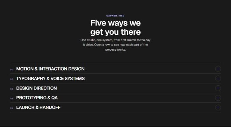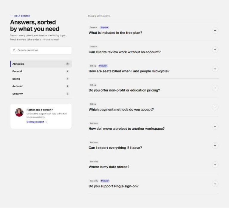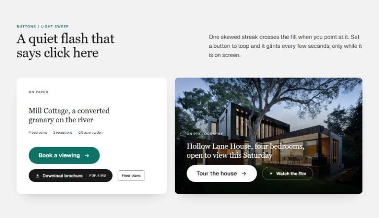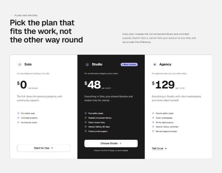

 Compare Features LandingLanding page, 1 page
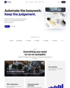 Flowline SaaS LandingLanding page, 1 page
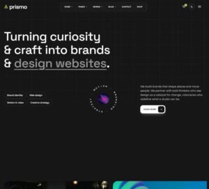 Prismo Creative AgencyCreative, 1 page
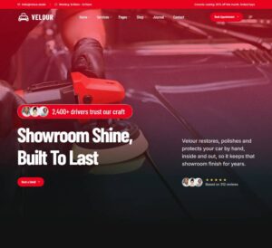 Velour Car DetailingLanding page, 1 page
Aurora Edge Button
Showcase section for the Aurora Edge Button: a link button whose hairline edge carries a travelling comet of accent light. The comet is a conic beam rotating inside a masked ring (Web Animations API), so pill and rounded…
50 sites for €79 only, Compare all plans
All photos and visual assets used in this preview are sourced from Unsplash.
The system behind it
One pattern, your whole brand.
Aurora Edge Button reads your ACSS tokens, so changing a color, a font or a spacing value once restyles it everywhere. No hard-coded values, nothing to override.
- Type
- Component
- Category
- Buttons
- Responsive
- Desktop to phone
- Works with
- Bricks, ACSS, plain CSS
Options 2
Set on the section, in Bricks’ attributes panel. No code needed.
data-speedms per orbit
data-boosthover speed multiplier · data-anim rise|fade|none, data-note true|false
Component props 1
Only the repeating unit is a component. Duplicate, reorder or delete it in Layers and edit these props.
labelStart free trial
url#
target_self
ariaLabelStart free trial
sizem
fillsolid
motionorbit
shapepill
showIconTrue
iconarrow
iconPositionend
showBadgeFalse
badgeNew
speedempty
boostempty
Free pattern. Yours to use on any site, no plan needed.
Included in Pro €99 once with Pro Unlimited Lifetime: all 785 patterns, unlimited sites.
Get Pro