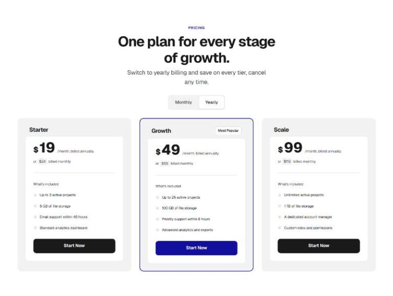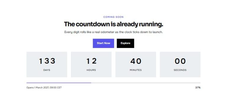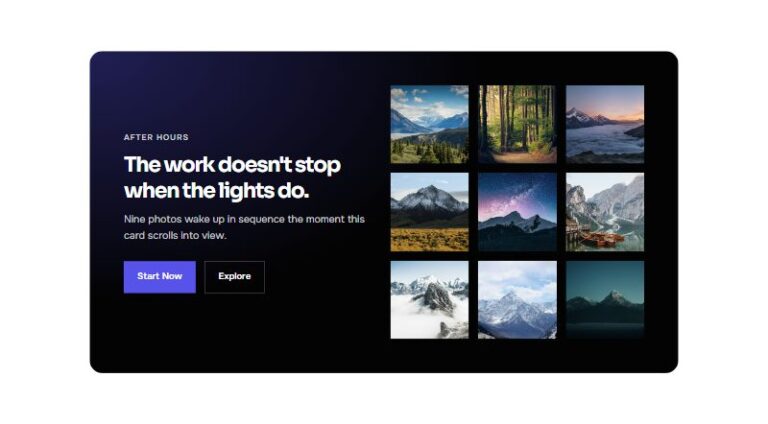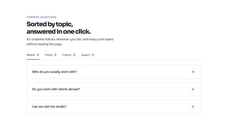

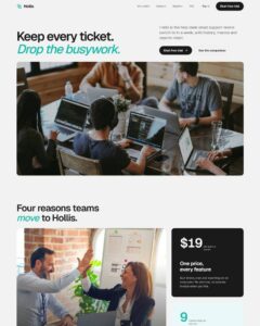
 Compare Features LandingLanding page, 1 page
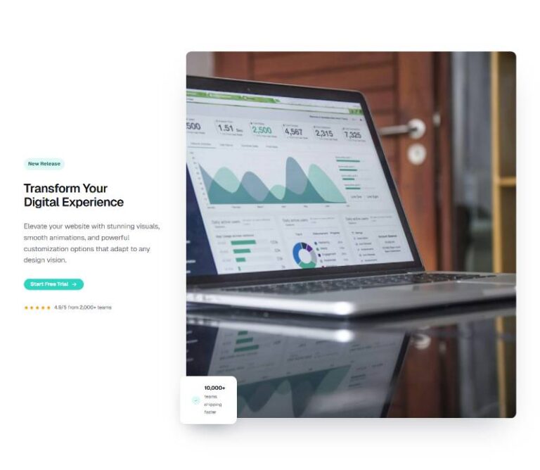
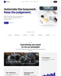 Flowline SaaS LandingLanding page, 1 page
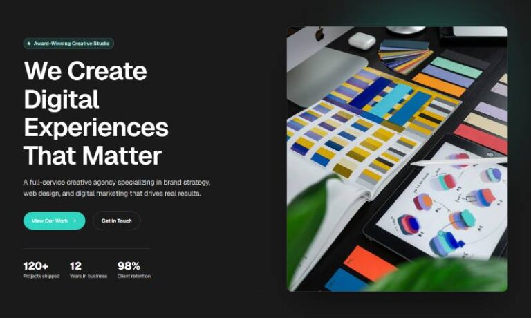
 Prismo Creative AgencyCreative, 1 page
 Velour Car DetailingLanding page, 1 page
Banded Header Feature Grid
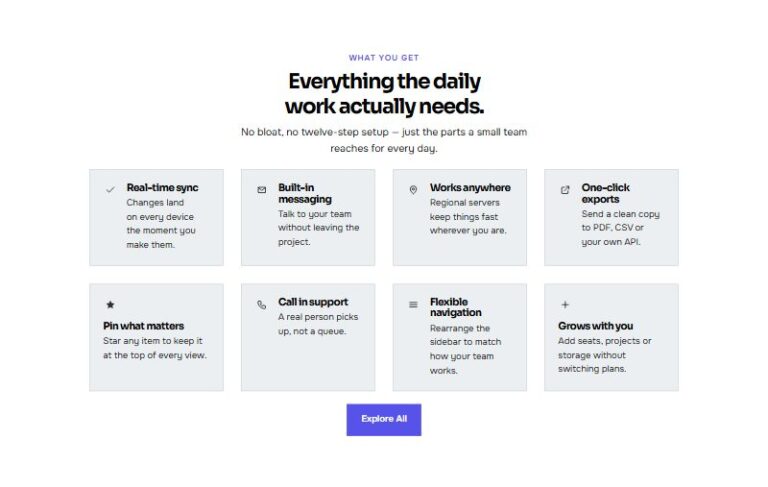
An eight-card feature grid, each card leading with an icon and title in a shaded header band above a divider, with the description sitting below. Feature Card component props: icon, title, description. Steps from one co…
50 sites for €79 only, Compare all plans
All photos and visual assets used in this preview are sourced from Unsplash.
The system behind it
One pattern, your whole brand.
Banded Header Feature Grid reads your ACSS tokens, so changing a color, a font or a spacing value once restyles it everywhere. No hard-coded values, nothing to override.
- Type
- Layout
- Category
- Features
- Responsive
- Desktop to phone
- Works with
- Bricks, ACSS, plain CSS
Component props 1
Only the repeating unit is a component. Duplicate, reorder or delete it in Layers and edit these props.
iconcheck
titleAudit trail
descriptionEvery change is logged with who, what and when, kept for a year.
Free pattern. Yours to use on any site, no plan needed.
Included in Pro €99 once with Pro Unlimited Lifetime: all 785 patterns, unlimited sites.
Get ProMore patterns