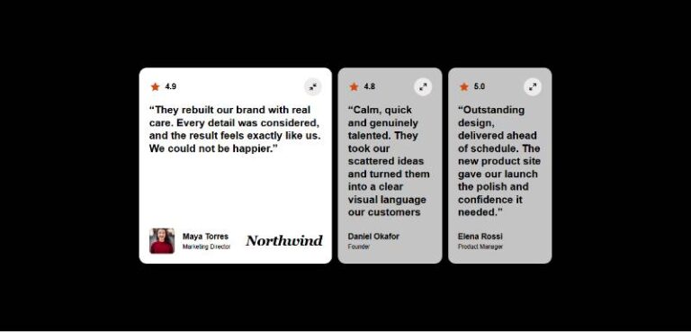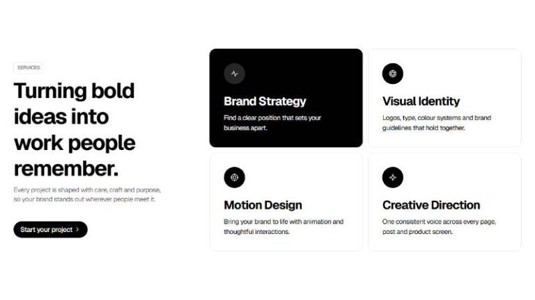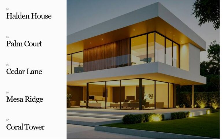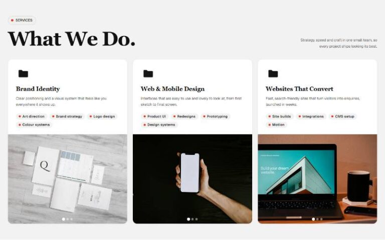

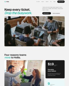
 Compare Features LandingLanding page, 1 page
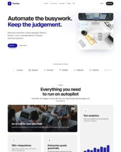 Flowline SaaS LandingLanding page, 1 page
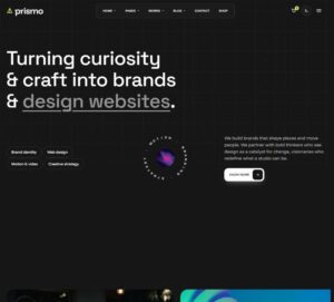 Prismo Creative AgencyCreative, 1 page
 Velour Car DetailingLanding page, 1 page
Category Tab Showcase Reel
An autoplaying showcase reel of eight "Showcase Slide" component instances (image, imageAlt, category select, kicker, title, showCaption boolean) grouped under two category tabs ("Objects" and "Marks"); picking a tab fil…
50 sites for €79 only, Compare all plans
All photos and visual assets used in this preview are sourced from Unsplash.
The system behind it
One pattern, your whole brand.
Category Tab Showcase Reel reads your ACSS tokens, so changing a color, a font or a spacing value once restyles it everywhere. No hard-coded values, nothing to override.
- Type
- Layout
- Category
- Sliders and carousels
- Responsive
- Desktop to phone
- Works with
- Bricks, ACSS, plain CSS
Options 17
Set on the section, in Bricks’ attributes panel. No code needed.
data-themesection theme
data-tabsshow/hide the category tab bar
data-tabs-positiontab bar placement relative to the reel
data-autoplayand
data-delayms
data-loopadvancing past the last slide wraps to the first
data-easingslide-shift easing curve
data-durationms · slide-shift transition duration
data-peekhow much of the neighbouring slides shows at the viewport edges (small/medium/large peek)
data-gappx · gap between slides
data-radiusslide corner radius
data-captionshow/hide the title/kicker caption on the active slide
data-arrowsand
data-arrows-positiondata-paginationand
data-pagination-positiondata-autoplay-buttonshow/hide the pause/play toggle
Component props 1
Only the repeating unit is a component. Duplicate, reorder or delete it in Layers and edit these props.
imagehttps://images.unsplash.com/photo-1512446816042-444d641267d4?w=900
altCompact smart speaker resting on a stack of books
categoryobjects
kickerObject study
titleWeight, held in a small form
showCaptionTrue
Included in Pro €99 once with Pro Unlimited Lifetime: all 785 patterns, unlimited sites.
Get Pro