
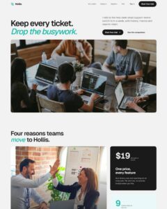
 Compare Features LandingLanding page, 1 page
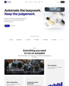 Flowline SaaS LandingLanding page, 1 page
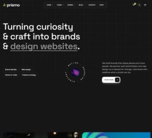 Prismo Creative AgencyCreative, 1 page
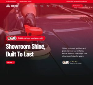 Velour Car DetailingLanding page, 1 page
Minimal Header
Swiss-editorial studio header as a plain, fully editable Bricks tree: header > head (bar: brand mark + wordmark + descriptor; menu holding a "Hairline Nav" wrapper component with "Nav Link" instances; aside with availabili…
50 sites for €79 only, Compare all plans
All photos and visual assets used in this preview are sourced from Unsplash.
The system behind it
One pattern, your whole brand.
Minimal Header reads your ACSS tokens, so changing a color, a font or a spacing value once restyles it everywhere. No hard-coded values, nothing to override.
- Type
- Layout
- Category
- Footers and headers
- Responsive
- Desktop to phone
- Works with
- Bricks, ACSS, plain CSS
Options 13
Set on the section, in Bricks’ attributes panel. No code needed.
data-themedata-accentACSS colour for the current-page dot, the CTA arrow hover and the mobile index of the current link
data-layoutspread centres the nav, end pushes it next to the actions
data-widthbar width
data-densitybar height
data-positionsmart = sticky that hides on scroll down and returns on scroll up
data-rulethe hairline under the bar, drawn in on load
data-statusavailability note (wide screens)
data-clocklive studio clock (wide screens and mobile sheet)
data-timezoneIANA zone
data-clock-formatdata-ctaCTA look
data-stagethe demo studio intro under the bar
Component props 3
Only the repeating unit is a component. Duplicate, reorder or delete it in Layers and edit these props.
hoverroll
easingsmooth
duration560
stagger18
labelPrimary
labelWork
url#work
currentFalse
showCountFalse
count18
showHintTrue
hintSelected projects, 2016 to now
labelurlIncluded in Pro €99 once with Pro Unlimited Lifetime: all 785 patterns, unlimited sites.
Get Pro