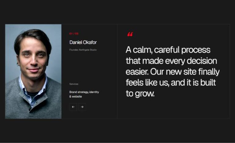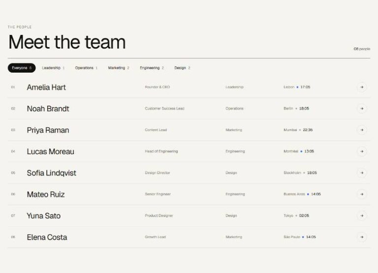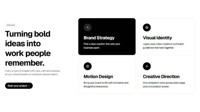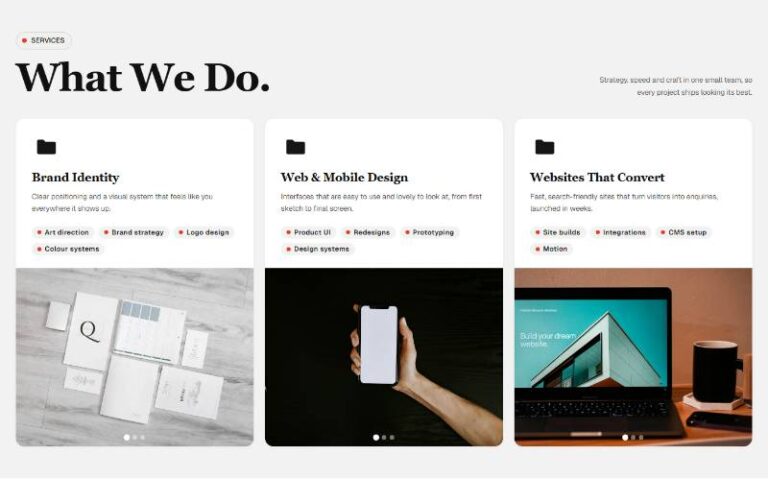

 Compare Features LandingLanding page, 1 page
 Flowline SaaS LandingLanding page, 1 page
 Prismo Creative AgencyCreative, 1 page
 Velour Car DetailingLanding page, 1 page
Orbit Arc Carousel
Plain editable section (eyebrow, heading, intro) on a deep gradient backdrop, holding six "Orbit Slide" component instances (image, alt, caption — duplicate/reorder/delete in Layers). Built on Swiper's coverflow effect:…
50 sites for €79 only, Compare all plans
All photos and visual assets used in this preview are sourced from Unsplash.
The system behind it
One pattern, your whole brand.
Orbit Arc Carousel reads your ACSS tokens, so changing a color, a font or a spacing value once restyles it everywhere. No hard-coded values, nothing to override.
- Type
- Layout
- Category
- Sliders and carousels
- Responsive
- Desktop to phone
- Works with
- Bricks, ACSS, plain CSS
Options 11
Set on the section, in Bricks’ attributes panel. No code needed.
data-themere-themes the section
data-rotatedeg neighbouring slides tilt away
data-depthpx neighbours push back on the Z axis
data-spacing0-1 how tightly slides overlap
data-scale0-1 how much the centre slide is enlarged
data-autoplaydata-delayms
data-loopdata-dragmouse drag + touch swipe
data-arrowsand
data-paginationComponent props 1
Only the repeating unit is a component. Duplicate, reorder or delete it in Layers and edit these props.
imagehttps://images.unsplash.com/photo-1520975954732-35dd22299614?w=760
altA rider in a leather jacket crouched on a brick rooftop ledge
captionRooftop Line
Included in Pro €99 once with Pro Unlimited Lifetime: all 785 patterns, unlimited sites.
Get Pro