
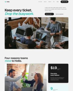
 Compare Features LandingLanding page, 1 page
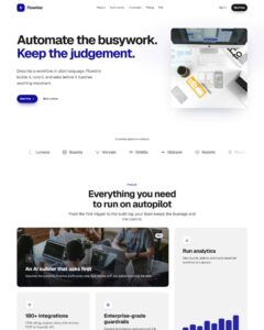 Flowline SaaS LandingLanding page, 1 page
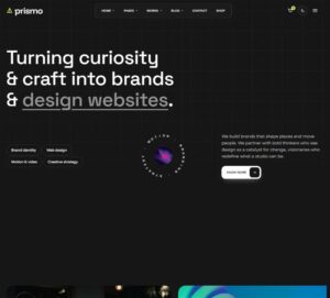 Prismo Creative AgencyCreative, 1 page
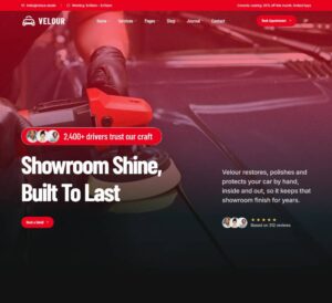 Velour Car DetailingLanding page, 1 page
Overlap Product Card
Wide product card: a rounded colour block with a rotated word mark, a dark detail panel that overlaps it, a product photo that straddles both, round arrow buttons, a size picker, a ring gauge, a rounded add-to-cart butt…
50 sites for €79 only, Compare all plans
All photos and visual assets used in this preview are sourced from Unsplash.
The system behind it
One pattern, your whole brand.
Overlap Product Card reads your ACSS tokens, so changing a color, a font or a spacing value once restyles it everywhere. No hard-coded values, nothing to override.
- Type
- Element
- Category
- Cards
- Responsive
- Desktop to phone
- Works with
- Bricks, ACSS, plain CSS
Options 3
Set on the section, in Bricks’ attributes panel. No code needed.
data-themesurface behind the cards
data-animentrance
data-accentcolour of the block, gauge and button
Component props 1
Only the repeating unit is a component. Duplicate, reorder or delete it in Layers and edit these props.
imagehttps://images.unsplash.com/photo-1583394838336-acd977736f90?w=900
imageAltOver-ear headphones
wordmarkSOUND
titleSTUDIO HEADPHONES
price$299.99
sizeLabelEAR CUP SIZE
gaugeValue75%
gaugeLabelBATTERY LEVEL
cartLabelADD TO CART
wishLabelADD TO WISHLIST
url#
Included in Pro €99 once with Pro Unlimited Lifetime: all 785 patterns, unlimited sites.
Get Pro