
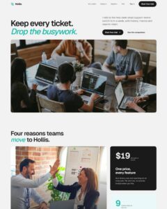
 Compare Features LandingLanding page, 1 page
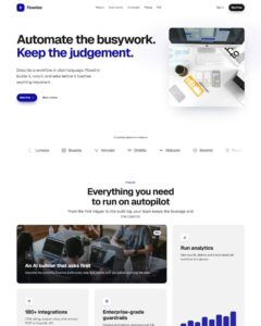 Flowline SaaS LandingLanding page, 1 page
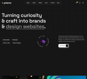 Prismo Creative AgencyCreative, 1 page
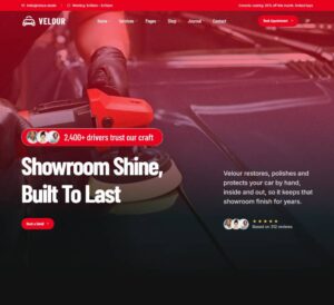 Velour Car DetailingLanding page, 1 page
Tabbed Media Feature Cards
Tabbed feature showcase where picking a thumbnail brings that feature to a large central stage card (heading, description and image or video) while the rest stay as a row of small thumbnails underneath. Plain editable se…
50 sites for €79 only, Compare all plans
All photos and visual assets used in this preview are sourced from Unsplash.
The system behind it
One pattern, your whole brand.
Tabbed Media Feature Cards reads your ACSS tokens, so changing a color, a font or a spacing value once restyles it everywhere. No hard-coded values, nothing to override.
- Type
- Component
- Category
- Cards
- Responsive
- Desktop to phone
- Works with
- Bricks, ACSS, plain CSS
Options 2
Set on the section, in Bricks’ attributes panel. No code needed.
data-thumbsand
data-transitionComponent props 2
Only the repeating unit is a component. Duplicate, reorder or delete it in Layers and edit these props.
id1
headingBuild your brand
descriptionA clear identity that feels like you, made to connect and stay in min…
mediaTypeimage
mediahttps://images.unsplash.com/photo-1460925895917-afdab827c52f?w=960
mediaAltFeature preview
videoUrlempty
id1
labelBrand
thumbhttps://images.unsplash.com/photo-1460925895917-afdab827c52f?w=160
thumbAltempty
Included in Pro €99 once with Pro Unlimited Lifetime: all 785 patterns, unlimited sites.
Get Pro