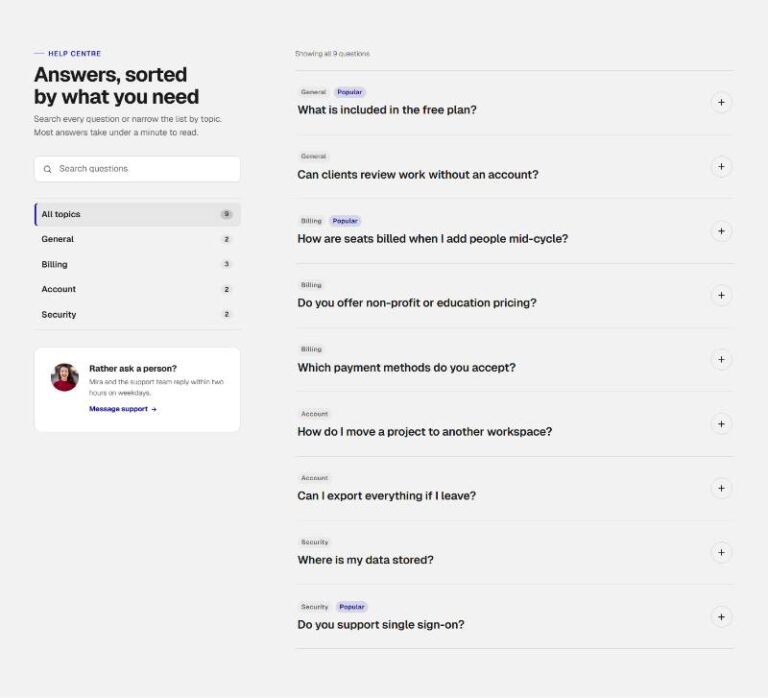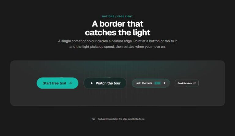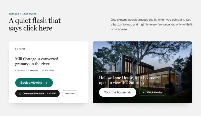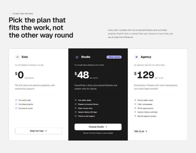

 Compare Features LandingLanding page, 1 page
 Flowline SaaS LandingLanding page, 1 page
 Prismo Creative AgencyCreative, 1 page
 Velour Car DetailingLanding page, 1 page
Editorial Accordion Rows
Display-weight, typography-led accordion built as a plain, fully editable Bricks tree: section > container > header (eyebrow, h2, intro) > accordion of five "Accordion Row" component instances (add, remove or reorder in La…
50 sites for €79 only, Compare all plans
All photos and visual assets used in this preview are sourced from Unsplash.
The system behind it
One pattern, your whole brand.
Editorial Accordion Rows reads your ACSS tokens, so changing a color, a font or a spacing value once restyles it everywhere. No hard-coded values, nothing to override.
- Type
- Component
- Category
- Accordions
- Responsive
- Desktop to phone
- Works with
- Bricks, ACSS, plain CSS
Options 5
Set on the section, in Bricks’ attributes panel. No code needed.
data-themere-themes the whole section
data-icontrigger glyph: a plus that morphs into an X, or an arrow that rotates from ↗ to ↓
data-numbersshow the 01, 02
data-sizedisplay type scale for the row titles
data-singleclose other rows when one opens (native <details>, no JS required either way)
Component props 1
Only the repeating unit is a component. Duplicate, reorder or delete it in Layers and edit these props.
number01
questionMotion & interaction design
answerWe storyboard every scroll cue, hover state and transition before a s…
tagMotion
linkLabelempty
linkUrlempty
Free pattern. Yours to use on any site, no plan needed.
Included in Pro €99 once with Pro Unlimited Lifetime: all 785 patterns, unlimited sites.
Get Pro